5 Realtor® Branding Myths, And How To Avoid Mistakes
The term Branding can be an ambiguous word for many business people. When many so-called graphic designers cannot even get a full grasp of it, it is hard to define what exactly is entailed in this branding process. Our Realtor® Branding Services comprehensively address all the objectives you have when it comes to branding your real estate business.
Lack of understanding of what a true branding job is can lead to a series of mistakes that can be costly down the road, both time wise and financially.
Myth #1
I will brand later when my business grows.
Many real estate agents take the position that investing money into a branding scheme is something they should do later when there is more budget, and will hold off on it. This is one of the most common and costly mistakes you can make.
Why it’s a poor choice for your business
Whatever business cards, envelopes or feature sheets you get from your brokerage or print off on your own from your computer will not have any originality to it, rendering it mundane and forgotten among the pile of other junk. At this phase of your business when you are new & fresh, you don’t want to emphasize the lack of experience. Self-made cheap stationery, or generic brokerage provided items (unless you are with a heavily branded firm like Sotheby’s) will scream “I’m green and fresh with no budget nor experience!” Is that the brand message you want to send?
How it will cost you more $$$ in the long run
Eventually as your business grows, you will invest into a branding system (hopefully). When that is done, whatever business cards you have printed, whatever letterheads printed etc. have all gone to waste. You will also have wasted valuable months of your business phase during which your gorgeous, noticeable brand could have been exposed to more customers in your community, and online. The lost printing costs as well as the opportunity cost will far outweigh the cost of our branding packages, which start at a mere $400.
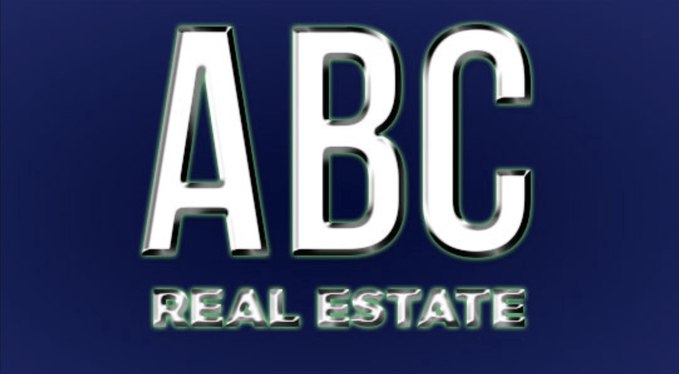
A great example of a poorly designed photoshop logo that has a lot of shiny visual effects that will NOT print very well at all.
Myth #2
I can just get my friend who’s good with Photoshop to do this.
Everybody has that one friend who’s “good with Photoshop” that offers to design a logo for you for a bottle of wine. It seems like a great cheap (or free) way to get your branding set up. Seems like a great idea, right? Wrong.
Why this will dissapoint you
We’ve seen countless incidents of such, with real estate agents bringing us a “logo” done on Photoshop. For one, Photoshop is not a vector processing software meant for press printing, so whatever looks decent on the screen has a good chance of not working out so well once printed. A proper branding job should be consistent across print & digital. Many logos have fancy metallic, gradient designs etc. without any plans on how to effectively translate that into printed surfaces. If your online logo and your business card logo has no cohesion, you do NOT have a branding scheme at all. You just have a stand-alone emblem that cannot play with others!
What a proper branding job looks like
For one, it starts with an in-depth interview of who you are, then the artwork is produced, along with a proper colour scheme and a font scheme that works in harmony. We also ensure that the brand can be consistently replicated on digital & print, on coated and uncoated surfaces, as well as on black & white. The brand should also look good in inverted colour schemes (Whether you print on black or white backgrounds), and easily applied to unconventional methods such as engraving, stitching or round-surface printing.

A great example of a poorly designed photoshop logo that has a lot of shiny visual effects that will NOT print very well at all.
A good business branding system is more than just a doodle on Photoshop. Overuse of gradients, shadows, shines and other effects that ONLY look good on computer screens will lead to failure, as the main effect you considered critical to your brand cannot even be printed consistently.
Myth #3
I should use the font used on my logo on all material.
Your name on your logo that your photoshop-fluent friend is written in a fancy font, and your first instinct is to ask “Can I have that font file?” because you want to use it on EVERYTHING you print. That is one of the worst ideas you can have.
Why this is a terrible idea
Look at some of the greatest brands in the world that have a world-wide recognition. Coca Cola, Johnson & Johnson for example have very memorable fancy fonts on their logo. You will not see that logo repeated anywhere else on any of their packaging, product titles, descriptions etc. The reason is that repetition of the same fancy font is an over-indulgence that actually dilutes the brand rather than strengthens it. It’s contrast that makes you stand out, not by drowning in the same font over and over.
What to do instead
A professional branding scheme will come with a set of recommended font faces to use in conjunction with your brand to ensure the brand is emphasized well. If you didn’t get your branding done by the professionals here at Brixwork, there’s still a way. Find generic, easy-to-read fonts that contrast heavily from the style of your logo font, and you are miles ahead of the amateurs who think that repeating the font is a great idea to get the brand across.

Examples of some of the most successful and widely known brands that utilize text based logos.

This website is the result of a poorly done, or non existent branding scheme.
Myth #4
I don’t think I need one, it’s not worth the money.
This is probably a worse mistake than #1. Many agents have all sorts of excuses to avoid the branding process. It could be that they feel that their brokerage brand is enough, or that their name & personality is enough. Also cost is another objection point.
Why it’s a gross act of mis-prioritization.
With the amount of competition of real estate agents out there, generic cards and names will be drowned out into oblivion very quickly. Our professional branding schemes, done in-house here in Gastown Vancouver, BC, cost between $400 ~ $1600 at most. Many car lease payments for just one month can fall somewhere in the middle of this range. To say that you cannot invest the equivalent of a month’s car lease payment into the face and forefront of your business is like saying “Why buy a suit when I can just wear my sweat pants to the meeting? I already have one, and a suit will cost me more money.”
How it will cost you in the long run
Similar to #1, the amount of time you are in business without your personal branding scheme is NOT helping you at all, and the lost opportunity cost can be enormous at the end. The longer you trudge along without a clear identity presence, the more business you are losing.

This website is the result of a poorly done, or non existent branding scheme.
Myth #5
A brand/logo has to be a complex shape.
Many people think of “logos” as a complicated piece illustrated artwork that involves swirls, lines, symbolic shapes etc. and see it as a daunting process. Not all logos need to look like a complicated medieval coat-of-arms.
False. Because Less is More.
Less is more has never been a truer statement. In a world that is over crowded with over stimuli, the simplicity and elegance can often make a bigger impact. We offer a full range of services from illustrated branding which involves custom hand-drawn, hand-crafted unique symbols, all the way to type-art branding, which leverages intelligent and elegant usage of beautiful typography and simple shapes.
Check out the gallery of elegance.
Some of the branding systems we’ve created over the years demonstrate this well. Check it out on our gallery of real estate agents that we’ve had the pleasure of working with!

This is a branding scheme we did for our client Chris Brown. It features bold shapes and text that are simple and memorable.
In Summary, You Need to be Branded

We’ve helped properly brand and present countless real estate agents over the years, and we’ve seen first-hand the tangible benefits of a proper branding system.
Our clients have reported getting more compliments from their clients, which means they are more likely to remember him/her over the competitor. We’ve heard of new & unexpected listings being acquired through proper presentation of marketing material at open houses. We’ve heard of listing customers who were excited to see all the properly branded & consistent property feature sheets and mailers, which indicates confidence in our clients.

