The Identity of Louis Riel’s Wife???
One of my memories from high-school include wondering why textbooks were formatted as they were. It was long – with paragraphs after paragraphs with a section break every page or two. To find something important, I had to scan through the tiny text for a while… and finally I’d find the tribe from which Louis Riel’s wife was from. It was boring, time-consuming to scan through, and it made me fall asleep. If textbooks were formatted in more interesting and attention grabbing ways, perhaps we would have all paid more attention.
It’s not as interesting to them as you’d think!
When one writes out his or her own biography, article or any other content, they are self-absorbed and narrow-perspectived- however the others visiting your site don’t necessarily share that enthusiasm about you (yet). Drowning the visitors with the typical “I care about you, I can negotiate, I put clients first, I have experience, I have a family and a dog” in 4 paragraphs is biography suicide. In fact the above short sentence would be more effective compared to having it take up half the page in longer sentences.
The question that the modern day marketer has to ask is, “How do I format my page so it’s not boring? How do I get across to my potential client without losing them among lines of scribble?” There are ways to make sure your website text is more interesting than my History 12 textbook from 10 years ago.
How to Make Your Content Text More Engaging, Less Boring, and More Effective/Efficient
1. Use Headings In Your Content Text
Website text is broken down largely into headings & paragraph text. Headings range from heading 1 to heading 6. Headings are like the pack leaders – for each paragraph or two, you should always put a heading above it that emphasizes the key points. Assume that 95% of visitors will scan through the headings and not even bother with your paragraphs (at least at first, they won’t).
What this technique can do for you:
- Summarizes each paragraph, often with a colourful & larger font.
- Creates visual division between long blocks of text, and draws the eyes quickly.
- Gets the key points across to readers before they get bored by the long paragraphs.
- Even if somebody had no intention of reading more, an enticing heading will get them to take a second look.
- Keywords in headings have a larger impact on how Google sees your site. This has search engine optimization implications!
2. Bold, underline or italicize some of the text
If there are certain keywords within a paragraph that you’d like to put some extra jazz into (“Award winning”, “Vancouver local resident for 25 years” etc. are good examples), feel free to make those blocks of text bold, italic, underlined (or a combination of them). Just be careful to not over-do it – if you have too many of these, your content is going to look like it’s been ravaged by a pack of rats. Pick just a few very important ones you want to really get across to your new leads on your webpage.
What this technique can do for you:
- Like the heading, draws the eyes by the emphasis.
- For readers who are quickly scanning, they will pick up the keywords.
- Google also likes to put more weight on words that are bolded or underlined. Accented words have a lot more relevance than the other several hundred words.
3. Don’t make your paragraphs too long. Use techniques #1 & #2 to help you achieve this.
Be concise. Short paragraphs are more popular, not only to high-school kids reading a textbook. If one sentence will do, don’t make two – instead, get more juice across by bolding some of the text that really matters. Don’t try to make two large points in one paragraph when it can be split into two.
What this technique can do for you:
- Keeps your page clean & tidy, without being too long.
- Not overwhelm the other elements of your page.
- Give the due attention to headings & bold text for faster communication to the readers
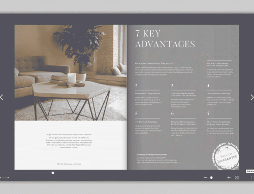
An Example on Rhiannon Foster’s Website
Here is a before & after shot comparing the homepage intro text. After the text was modified to include some key headers, and some of the text bolded, the main points are delivered to viewers much quicker – Core Business Values, Professionalism, Authenticity & Education.

Before & After The Text Styling