Project Description
Azure Properties Group
Custom Website, Print Media, Stationery
Branding Cleanup
Branding cleanup allows the client to renew and improve their defining style. After revitalizing the Azure logo by simplifying the design to be more geometric, we established a typographic family to instil coherence & consistency into Azure’s communications. This branding cleanup has allowed a well-known family business with an incredible track record to prepare itself for the projects to come.

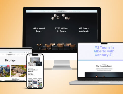
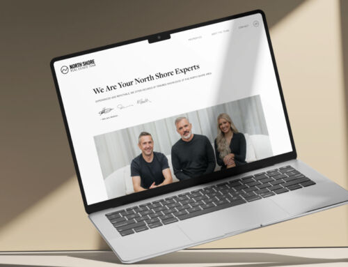
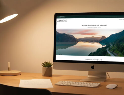
Stunning Fully Custom Website
When we started designing Azure Properties Group’s website, we knew it had to be special. Their website welcomes visitors with a picturesque coastline rooted in Azure’s namesake colour. Working with a blue-and-white palette, geometric patterns and animated line art create a pleasing yet dynamic website experience. Project pages feel like their own websites, highlighting each project with immersive, vibrant full-page headers and the same comprehensive gallery features trusted by top Realtors®.
Bespoke Print Media
To design custom stationery is to design a first impression. For Azure Properties Group, we wanted to provide them with custom-designed stationery – business cards, brochures, folders, booklets – which reinforced their image as a professional, dynamic and reliable property developer. Subtle geometric patterns marry perfectly with a minimalist, geometric logo.

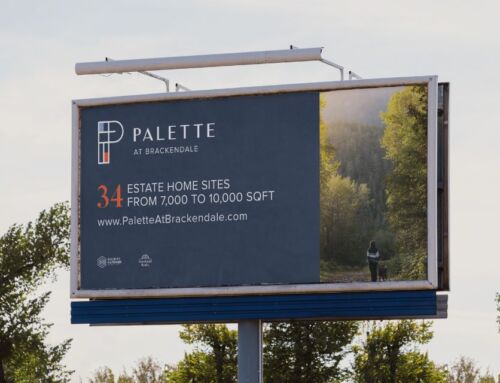
Custom Signage
For Azure Properties Group’s signage and construction hoarding, we wanted to take advantage of curb appeal by extending motifs and colourway from custom website and stationery. From site surveying to project completion, this signage will announce Azure’s presence and serve as lasting marketing for the duration of each project.