Project Description
Chris Brown
Custom Illustrated Branding, Print Media & Stationery
![]()
Custom Illustrated Branding
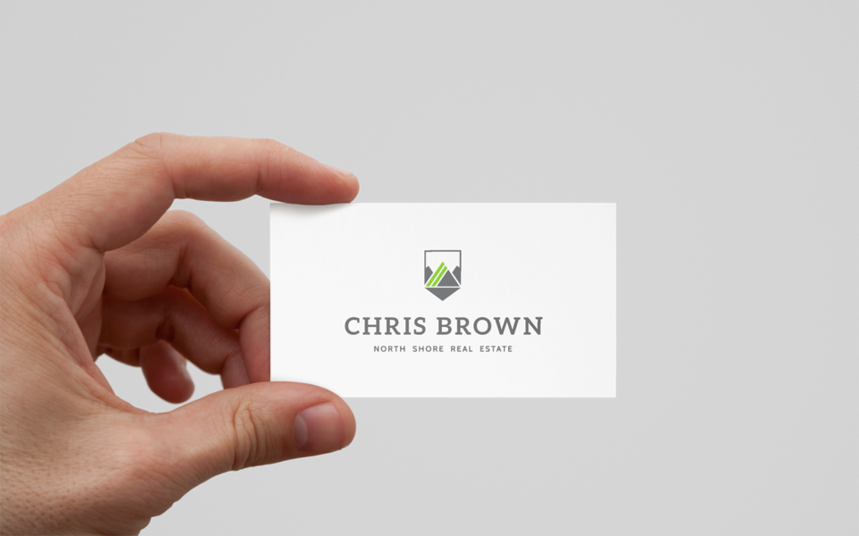
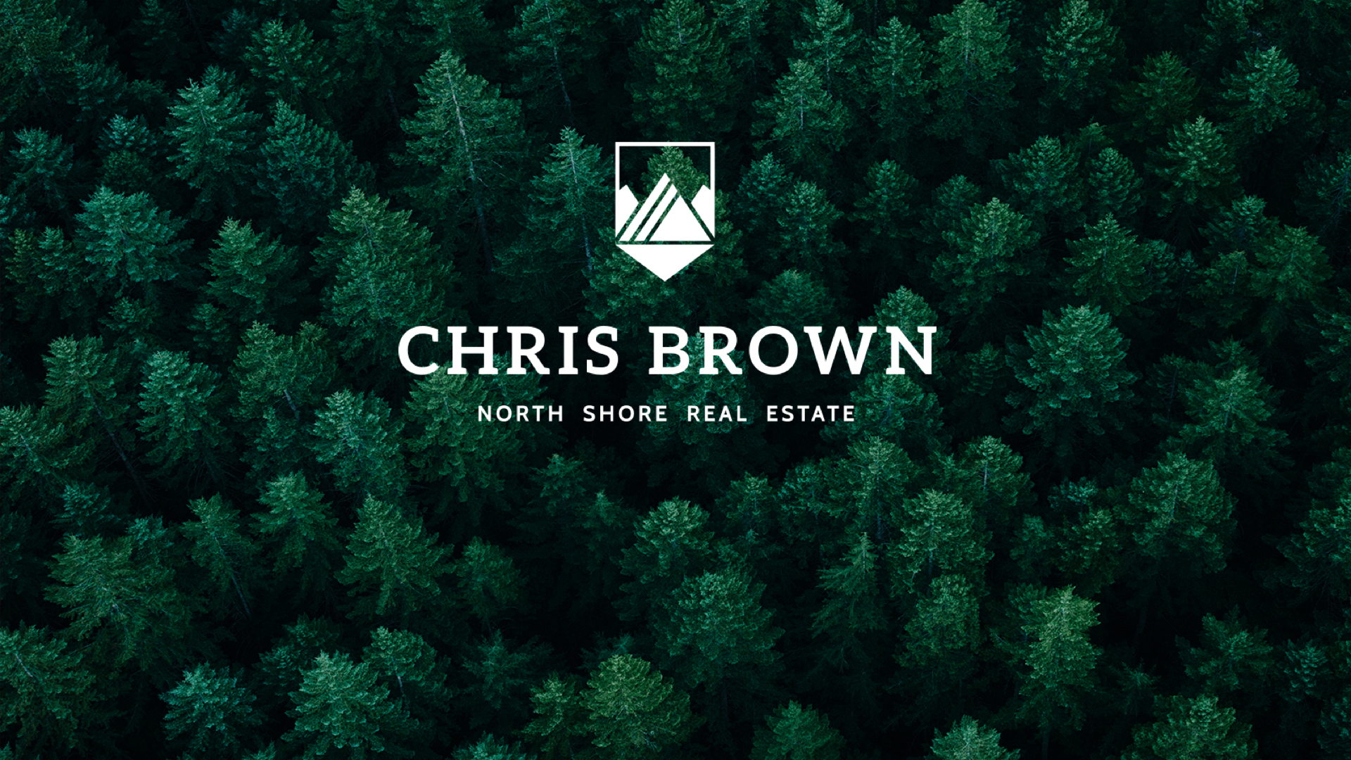
This is one of our most favourite branding jobs of all time. The map location (pin-drop) symbol signifies Location (in real estate, they often say “Location, location, location!” while the illustration within it showcases Grouse Mountain with the 2 gondola lines going through it – a local symbol of the majestic nature of the West Coast!
This perfectly illustrates Chris Brown’s character – a true local citizen with love & enthusiasm for the great outdoors (he’s quite the skier and mountain biker!). Real estate agents are not just brokers – they are lifestyle consultants, and Chris Brown’s branding shows that side of him for a more personable approach.
Stand out from the competition!


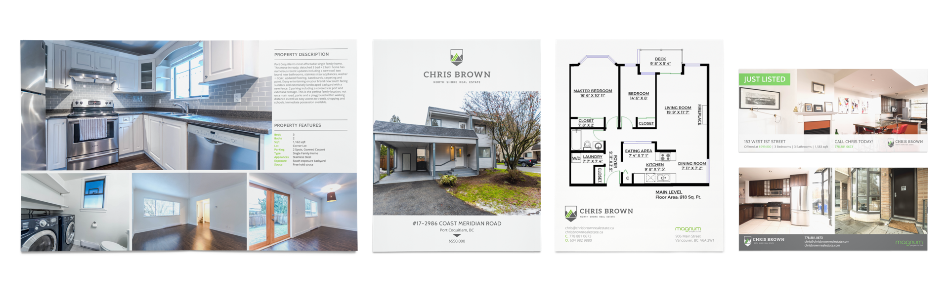
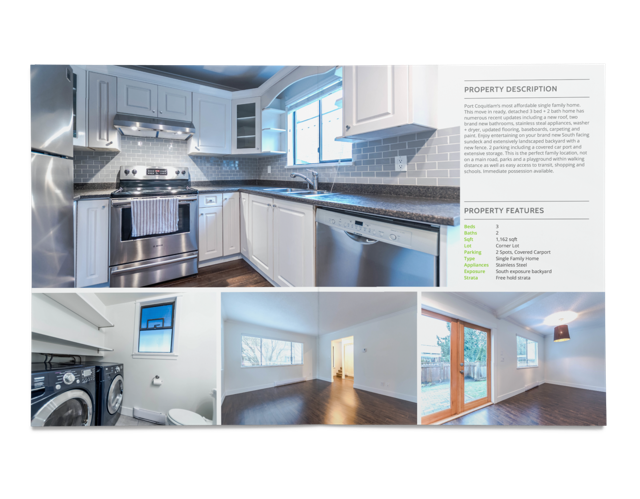
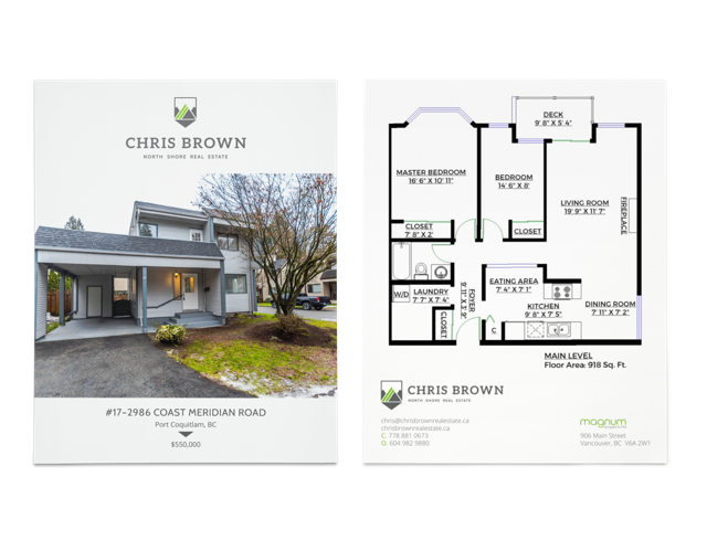
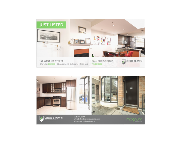
Stationery Design & Print
Chris’ branding carries that rustic yet elegant feel of the Pacific West Coast, and our design team carried on that look & feel to all the printed goods as well. To help Chris tackle the North Shore & Squamish real estate market, we produced his business cards on a rustic raw-textured paper that is thicker than the norm. Brand image doesn’t stop at looks – it’s about how it feels in your hands.
A well thought out, agency-grade branding campaign can help you truly connect with your clients as more than just another Realtor® – it can make it much more personal.