As we constantly strive to stay ahead of our competitors (who have been recently catching up frantically with some of our 2 year old features such as descriptive & Google friendly URLs), we are preparing another offering of some great functionality. Some of our clients’ websites have experienced close to 4X traffic from mobile devices between 2010 and 2011, and the trend continues. Being able to accomodate the mobile web traffic from iPhones, Blackberries, Android phones, and other tablets such as the iPad and the Playbook is critical to ensuring your customers see the best of you at all times.
Although our websites have already been mobile-friendly by following standards such as not using Flash animation, and using a 960 grid which is still considered the most universal website grid system that is more applicable to more devices, we decided to take it a step further.
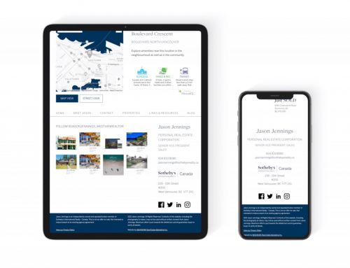
A scalable grid concept has been adopted by BRIXWORK {real estate} after lengthy research. With this new system, your websites will automatically scale, and have different display styles on different parts depending simply on the size of the viewport on the client browser. This is a far more superior option compared to having a separate mobile site developed, and here’s why:
- With a separate mobile site, the detection of devices is unreliable as new devices are released in the market all the time. It will inevitably choke at times.
- A separate mobile site is very expensive. Either you have a mobile site that looks nothing like your regular site, OR a much higher budget is required to manage both regular and mobile websites, which is often a burden for small businesses. It’s no big deal to Facebook, but for our neighbourhood Realtors®, this is not reasonable.
- This technology depends solely on the size of the viewport. That means this can accomodate people with smaller screens, or the odd occasions when somebody opens your website on a very small browser window. It’s not limited!
With our scalable mobile tech we hope to deliver a better Realtor®-client interaction to our clients. Here’s an example of how the scaling works, using our new website which is going to be launched this week:

The new BRIXWORK website on a full size browser

The new BRIXWORK website on a smaller viewport such as a tablet

The new BRIXWORK website on an iPhone or similar small device


