Do’s and Don’ts for Real Estate Websites
Seemingly Cool Website Modules That Are Really Just Annoying
Annoying
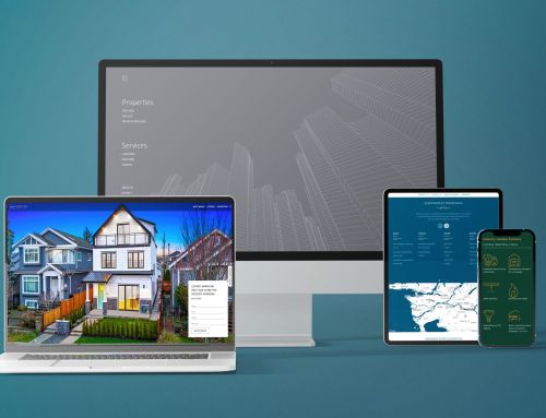
Hover Drop Down Menu
This was a default choice for a while – keep the main menu short, while showing the users the depth of options available! But the truth is most users are annoyed when dropdowns or pop-ups obstruct their browsing without intention.
A mindless flicker of a mouse covering up a photo irritates rather than impresses. Also, hover menus force a user to have to move the mouse so precisely through the hover funnel if one wishes to not activate the next hover menu by accident.
Impedes on Mobile Devices
Furthermore, tablets & smartphones don’t have a mouse-over option, so the tap (equivalent of a click) is the only option. Designing so that it reacts on tap on touch-friendly devices, while reacting on hover on others also adds a lot of costs, while degrading user experience. Let’s not even get started on what the behaviour should be on touch-enabled laptops that have both hover & tap as an option. In short, it’s a logistical nightmare
What to use instead:
Keep it simple – simple is good. Dropdowns should only appear on click or a tap, with intention and an obvious interaction that follows.
Experts Agree That Hover Menus Are A Bad Idea:
Annoying
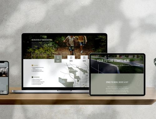
Listings in a Carousel
Carousels are great if you truly need to only display one thing at a time to bring focus to that item alone. Photo galleries and testimonials are a great example of such usage. However, when you want the users to see the array of different options, or you want to show how many listings you have, this can backfire.
Sliders are fine to use on photo galleries!
On Content to be Browsed/Read, Carousels are an Annoyance
When you are on a specific item number on a carousel, all others are invisible. Customers most likely want to scan through all the listings available in a region, or browse through all your sold listings. Hiding the rest while showing one at a time is completely counter-productive while forcing the user to do more work (more clicks/swipes that are not necessary).

What to use instead:
Display all of your listings in a simple tiled gallery format so it’s quick & easy to scan through many at a glance. That’s what your customers want.

Annoying
Long Lead Forms and Forced Logins
There was a time when automation/workflow gurus thought it would be a great idea to gather more information about a lead on a website form to get more info with less effort. Furthermore, offering more info in exchange for signing up would increase the number of leads. Boy, did these ever backfire!!!
Long Forms Get Little To No Action
Too many fields reduce the number of people filling it out, cutting down on your leads. A long detailed form that asks about the buyer’s budget, timeframe, whether they have pets or not… is the perfect way to turn leads off. “I’ll fill this out later” becomes NEVER.
Forced Logins (AKA Gated Content) Turn People Off
People already have too many accounts and logins to remember. Very few websites can pull this off – only if clients think that the information offered is ONLY available there. Real estate listing information is widely regarded as public information – they can get it on Realtor.ca, or on their iPhone app so easily. This is another great way to block a potential lead from giving you their information.
What to use instead:
The lead form should be as simple as the Facebook sign-up form – only email & name, like we do on our websites here at Brixwork – to get more leads. Gathering more information about them through follow-up is what you are born & bred to do as a Realtor®!
Great Tools To Get More Information About The Lead:
If you want to gather more intel on your leads, such as their geographic location, timeframe to buy/sell, budget, and more, we recommend the following tools (after you got the lead):
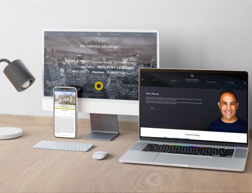
Great Websites are Designed in the Eye of the End User
Amidst all of this, never forget that good designs convert better, and vanity works! The Brixwork design team takes a scientific approach with human psychology in mind when we design our websites and print media. Agency-grade boutique design & marketing means more than just fancy photos with bold captions – it means true professionalism in design.