Project Description
Sunny Sangha & Associates
Custom Website, Branding, Print Media & Stationery

Custom Illustrated Branding
Hand-sketched from scratch, this one-of-a-kind logo concept became the foundation for their brand presence. This Realtor® logo is bold and sophisticated, powerful and inviting at the same time.


Print Media & Stationery
Look great everywhere, feel confident every time – that’s what our bespoke stationery design brings to our discerning real estate agents. Our clients want more than the generic stuff handed out by their brokerages.

Designing Beyond Roof or Key Silhouettes on Real Estate Logos
The Lower Mainland (Vancouver BC and the surrounding areas) is one of the most competitive real estate regions in Canada, if not the whole world. Standing out among the tens of thousands of Realtors® is no easy feat. That’s why our custom illustrated branding will NOT fall back to the cliches that everybody already has abused thousands of times, such as roof silhouettes, window shapes, or a key shape as the logo emblem.
The Concepts Behind Sunny Sangha Team’s Brand
The team wanted to convey a sense of trust and tenure, although many members are on the younger side. The initial sketches included chess pieces, family crest style designs, as well as marine symbols. These were deemed as a bit too traditional and not reflective of their digital-savvy marketing strategies in a modern world. We utilized the S shape to incorporate it into an emblem with a regal diamond shape completed with modern lines.
The Winning Logo Design and The Brand Guideline
The chosen illustrated emblem was paired with black and gold, a beautiful combination of colours that also matches their brokerage, Century 21’s brand guidelines. The sans-serif headings give a bold and modern impression, while the serif body font is welcoming and easy to read.
Well-established meets cutting-edge is what this brand design embodies, and it is showcased well across all their medium from business cards to the website.
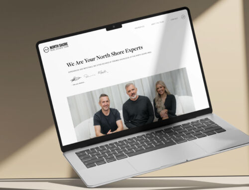
Semi-Custom Website
We custom designed a stunning homepage and a storytelling team roster page complete with case studies to help these incredible agents stand out among a sea of Realtors® in the lower mainland.