Realtor® Logo Design Do’s and Don’ts: 4 Costly Branding Mistakes
Standing out in an ocean of competing agents isn’t optional—it’s high-stakes survival!
Real estate agents across Canada & USA are in some of the harshest competitive business environments, especially in challenging high-interest, low-sales markets like we see now in 2025.
While national banks like Scotiabank or BMO have a dozen competitors, licensed real estate agents face hundreds if not thousands of competing agents chasing a slice of the pie. Standing out is not a luxury, but a necessity for survival.
Why Branding Matters, And The Role Your Logo Plays In It
What your business image looks like, how it feels, what your business identity is to your audience -that’s the definition of branding, and what will help you stand out against your competitors.
01
Branding: More Than A Logo Design
The colour scheme and typography, how photos and text is placed with each other, headings and taglines are all part of it.
02
The Logo Is At The Core Of Your Brand
There’s a reason why many mistakenly think “logo design” is “branding”. It is the crown jewel of your branding after all.
03
Typography and Colours Interact
The typography chosen, and the colour scheme, revolve around the main logo so they complement each other in style.
Your logo isn’t just a pretty symbol. It’s the first impression, the memory trigger, the avatar of the fabulous Realtor® that you are. This is a critical foundation for any business (not just real estate), and not designing this right from the start can cost you sales by killing brand awareness opportunities.
Poor branding doesn’t just look “meh” or “yuck”—it literally costs you money. We explain 4 common logo design mistakes we see far too often in our niche of real estate.
Mistake #1 in Realtor Logo Design: The Cliché House & Key Syndrome
It’s been done and done, plastered all over Fiverr, Upwork, even Pinterest—just google “real estate logo.” You will see hundreds of identical silhouettes of a house and windows, or yet another key shape, possibly a condo tower outline, the list of the same unoriginal concepts goes on.
If the goal is to be memorable and outstanding, this is not the way to design your logo for your real estate business. You will be one of hundreds of imitators.
Why This Kills Your Brand
- You cannot stand out with a shape everybody else already has.
- Signals you’re out of touch with modern marketing best practices
- Some may even see through how cheaply and generically it was made.
- Clients wonder: if you’re cutting corners on your own brand, where else are you cutting corners?
The well-established Realtor® who’s had a house logo since 1995 can get away with this, but most new agents ought to explore more original and tasteful ways.
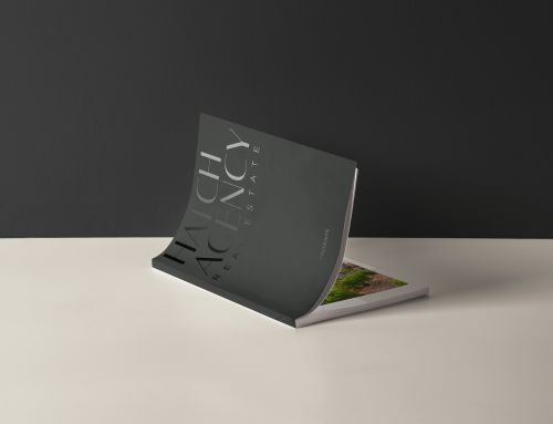
Instead, Consider An Original Symbol, or Your Name/Initials For Your Real Estate Logo
Don’t try to repeat you sell property. That’s made abundantly clear by your brokerage logo which accompanies every marketing piece you hand out.
Instead, think about what makes your brand name memorable when it comes to designing your logo, and let a 3rd party (such as a professional graphic designer or branding agency) give you an outside perspective. Design your new logo around your name or team name. Your initials expressed artistically like Karin Ericson’s logo can be stylish and original, or you can explore shapes or symbols that are genuinely unique to your niche like Nest Presale’s presale team logo or Paradigm Commercial’s brokerage logo.

Mistake #2 in Logo Typography: The Unreadable Name Disaster
Here’s a scene that plays every day: a potential buyer or seller drives past your FOR SALE sign. They slow down, try to read your name… and can’t! Your elaborate script font may look fancy, but it’s illegible as one drives by.
“I had driven by those signs several times, but I could never make out her name. It was written in a fancy hand-written font, and I think it was a French name…”

The Hidden Cost of Fancy Fonts on Logos
- Cannot read and absorb it as people drive/walk by quickly.
- Harder to read when shrunk down to social media icon sizes.
- Non-native English speakers struggle even more with decorative typography.
- Overly techy or futuristic fonts create similar readability problems,
Especially in large busy cities full of Realtors® as well as citizens from all sorts of ethnic and language backgrounds, a real estate logo that is hard to read universally will result in so many lost sales.
This is a classic mistake when a Realtor® fails to consider the perspective of strangers who do not know their names yet. Always imagine being your audience when it comes to design and marketing.
Instead, Design Your Logo With Clear Typography
Choose fonts that are instantly readable at any size, any distance, any speed. Your primary brand typography should be clean, modern, and unmistakable at first glance. Save the flourishes for secondary elements if you must use them at all.
Learn more about the critical role of typography in real estate marketing from this detailed analysis by our Creative Director, Jeff Kee, on REW.
Mistake #3 in Logo Design: The One-Size-Only Trap
Once upon a time, logos had one format and dimension. They needed to fit on a business card, across a sign behind the desk, on top of a letterhead. Those days are as old as Seinfeld, the TV show.
Now your logo needs to look great across dozens of applications: website headers, social media profile pictures, video watermarks, email signatures, promotional items, print materials, digital ads, and more. Each platform has different sizes and dimensions.
Having just one version of your logo is like owning only formal wear—sure, it works for weddings, but try wearing that to the gym.
How Single-Format Logos Fail
- Instagram profile pictures are circular and tiny—horizontal logos with taglines become unreadable specs on iPhones.
- Some website designs like horizontal versions, while others like vertical versions.
- Video overlays or photo watermarks require flexibility in size and orientation.
- Print materials sometimes need emblem-only versions for subtle branding.
Instead, Design Responsive Logos For Your Brand
Investing in a responsive logo design is no longer an option. This doesn’t mean multiple different logos—it’s variations of the same brand identity optimized for various mediums:
- Full logo in horizontal orientation.
- Full logo in vertical/stacked orientation.
- Simplified version for medium-sized applications.
- Emblem-only version for tiny spaces (social media icons, favicon).
- And more, as your marketing plans dictate.
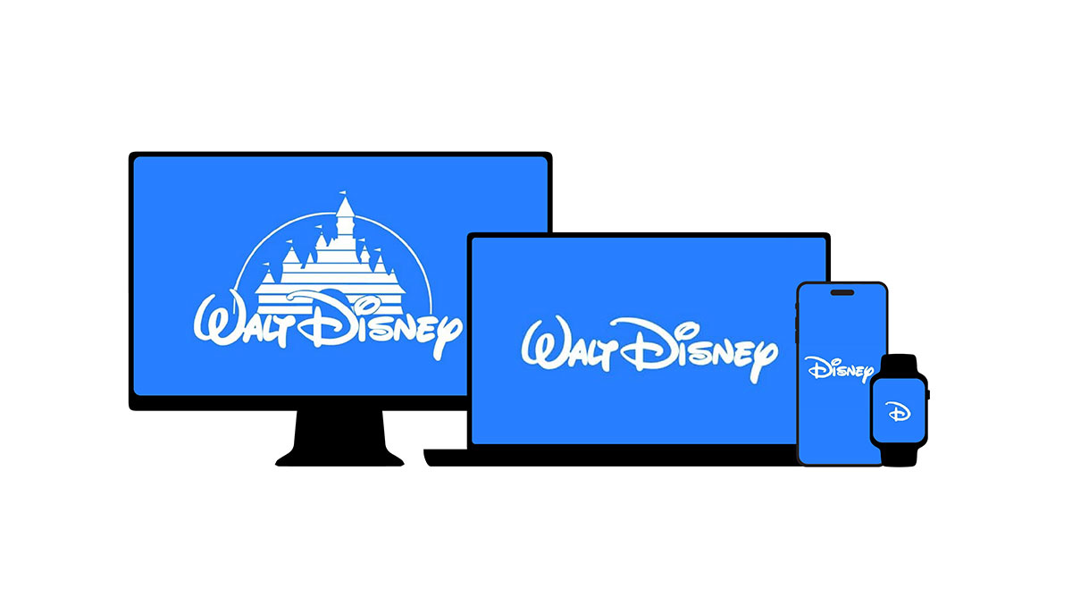
Credit: Meld Marketing, Inc.
Disney’s branding evolution in the 21st century as featured on Meld Marketing’s blog is a great example of responsive logo design. We designed Hasan Juma’s Realtor® logo to ensure multiple variations across print and digital, from large to small, all reflect its identity with clarity and preserve its uniqueness.
Mistake #4 In Logo Colours: The Gradient & Multi-Color Reliance
Your new logo presented nicely on your Macbook Air screen. The multiple colours add depth, and your brand feels modern and edgy. Then you try to use it as a watermark on a listing video – suddenly it looks broken. You attempt to engrave on a client gift (wooden box, water bottle or a t-shirt). It looks like a different logo. It looks messy and dirty when printed on your business card and folders.
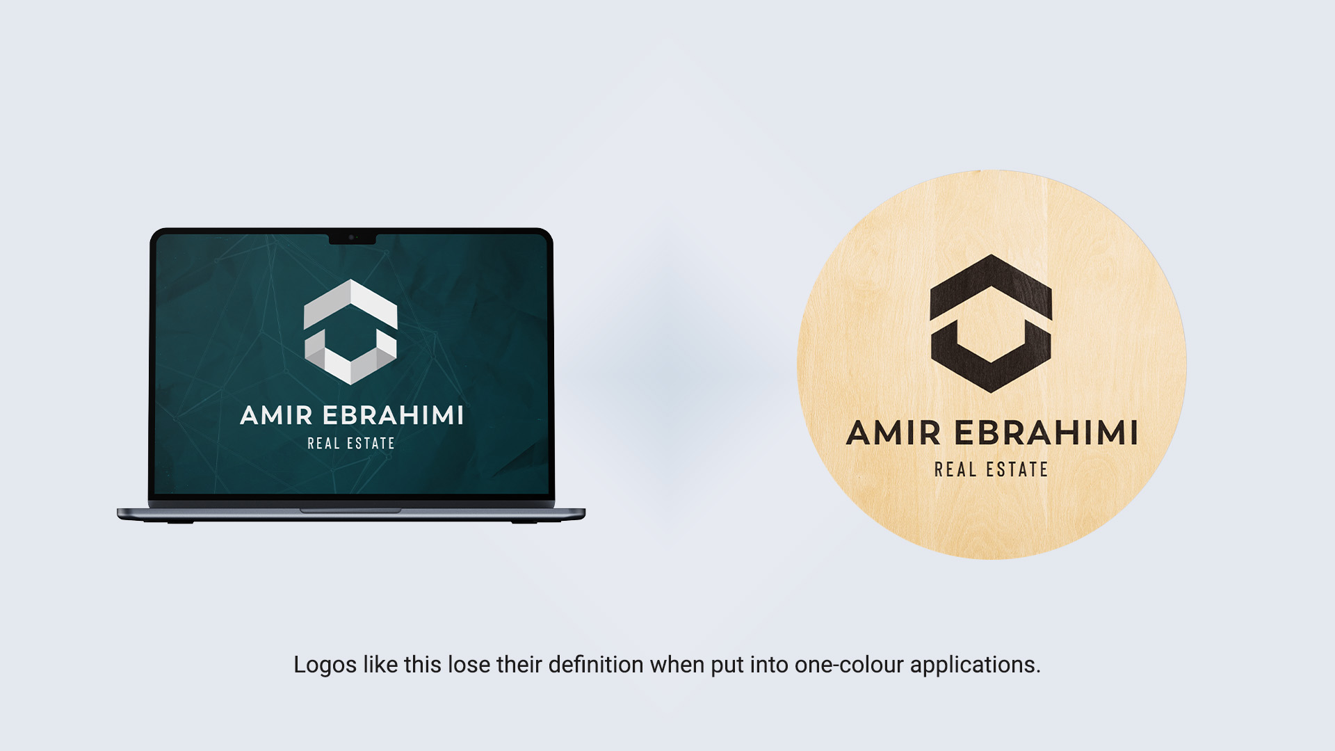
Logos that only work in full colour can restrict you from many applications, and result in brand consistency; basically a failed branding scheme. This is a common logo design mistake that can cost so much to repair, and in some cases it’s beyond repair and you’ll have to start all over again.
Why Color or Gradient Dependency In Logo Design Can Be Risky
- Can’t overlay effectively on photos or videos in all-white or all-black.
- Loses the shape and symbol when printed on black & white.
- Impossible to engrave, emboss, or deboss on physical items.
- Looks dull or distorted when printed on certain materials.
- Reproduces poorly at small sizes where gradient details disappear.
This is the telltale sign of amateur design. A friend who “knows Photoshop” might create something that looks pretty on screen, but they lack the professional experience to anticipate real-world applications. They never worked with a print shop or a tradeshow swag producer.
Instead, Design Logos With Monochrome In Mind From The Start
Design your logo to look clear and consistent in monochrome (single color). The structure, the shapes, the proportions—all of it should work just as well in black on white as it does with your full color palette. This ensures you have the flexibility to:
- Place your new logo over any photo or video as a watermark.
- Engrave or burn it on promotional items, gifts, and signage.
- Print it consistently (and cost effectively) on presentations and stationery.
- Use embossing and debossing techniques for sophisticated print materials.
Professional Graphic Designers Start Branding Design With Thought
Any experienced graphic designer or established branding agency approaches branding this way. If yours doesn’t, you’re not working with professionals. Our 2014 published guide to Realtor® branding myths has more cautionary tales that can save you a lot of grief and dollars.
The True Cost of DIY Logo Design
The lesson for real estate professionals: designing a logo with a DIY approach, from your own perspective, or letting your neighbour’s kid who’s “good with Photoshop” handle it comes with risks, and often ends up being much more expensive in the long run. The cost overruns for printing and re-design will seem small compared to the sales and commission lost due to poor brand awareness. And you won’t even be aware of these lost opportunities, which is even scarier.
“If you think it’s expensive to hire a professional to do the job, wait until you hire an amateur.”
The competition in real estate is fierce, and every unreadable sign, every unrecognizable social media icon, every poorly printed logo sends away valuable leads to a better-presented Realtor®.
Can you afford to be overlooked, or look unprofessional as an agent? Start your business image with the right foot. Our Branding services is one of the most powerful and popular offerings at Brixwork for good reason. Our best looking websites and print media often start with a foundation of a well-designed logo as part of a cohesive branding scheme.
Want To Seriously Explore Professional Branding & Logo Design Services?
Set up a consultation with us now to get your business identity built right from the start. In a sea of thousands of competing agents, being memorable isn’t optional—it’s critical.