5 Real Estate Rebranding Projects That Raised the Bar
It’s not just a logo redesign — see what a strategic real estate rebrand looks like when it’s done right.
In real estate, your brand is working even when you’re not. Realtors® have more competitors than nationally recognized brands such as major banks or cell phone providers.
Whether you are a new agent starting out, or an established team that is growing, a solid real estate brand is the cornerstone of your business image. A weak or outdated brand costs you listings before the conversation even begins.
Brand Design and Revamps (Rebranding) Has Been A Core Service
Over the past few years, Brixwork has worked with some of the top real estate agents and teams across Canada and the USA to deliver rebrands that go far deeper than a new logo. Here are some of the reasons why rebranding was a necessary foundation.
01
Growing Team, Or Expanding Scope of Services
Many agents grow their business into a team to serve more clients, provide a wider range of services, and work at a faster pace.
02
Responsive Logos for The Digital & Social Media Era
Logos designed years ago could not have predicted the rapid rise of social media and smartphones, requiring versatile, mobile-ready versions.
03
Original Was Rushed, Poorly Designed
It happens when you move at breakneck speed. The sooner you straighten out your brand, the better (and cheaper) in the long run.
5 Real Estate Rebranding Projects For Canadian Real Estate Agents
1. Phillips & Prem Real Estate Team — North Vancouver, BC
A Legacy Brand Evolved To A Great Partnership
Lance Phillips has been a cornerstone of North Vancouver real estate since 1984 — a name that carries decades of trust and referrals. When Nick Prem joined the team, they needed a rebrand with the new team name. In 2024, we delivered a soft rebrand that honours the past while signaling a bigger, better future.


- Website Re-Design: A custom-designed site with a storytelling team page and historical timeline — built to showcase Lance’s 40+ years in the market while introducing Nick as a natural evolution of that tradition. Visit phillipsandprem.ca
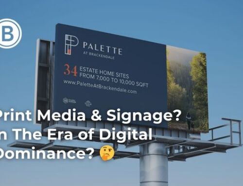
- Stationery & Print Media: Fresh new business cards, listing presentations, and print collateral — all elevated in quality, while carefully preserving the household name equity that Lance has built over decades.
Why It Works
Not every rebrand means starting over. Sometimes the smartest move is a refined evolution — keeping what resonates while modernizing what doesn’t.
2. North Shore Real Estate Team — North Vancouver & West Vancouver, BC
Streamlining a Prominent Brand for one of the most competitive markets in British Columbia
Led by Iain Edmonds, the North Shore Real Estate Team is one of the most recognized names across North Vancouver and West Vancouver. The rebrand focused on one thing: clarity. Clean lines, approachable typography, and a colour scheme that reflects the communities they serve.


- Logo Redesign: Simplified and modernized for maximum versatility — looks equally sharp on a yard sign in Edgemont Village or on a luxury property listing page.
- Website: Tastefully custom-designed with community guides for the North Shore, powered by live MLS® listing data and neighbourhood statistics. Visit northshorerealestateteam.com
- For Sale Signs & Presentation Kits: Bold, cohesive signage and listing presentation kits that make an impression at every open house and seller meeting.
Why It Works
It looks good everywhere, in any configuration, with stand-out brand presence and an iconic emblem design.
3. The Haase Team — Toronto, ON (Coming May 2026)
A Modern Identity for a Mother-Daughter Real Estate Team in the Greater Toronto Area
The Haase Team is a family-run powerhouse in Toronto, bringing a unique blend of veteran experience and modern perspective to every transaction. As a mother and two daughters, they needed a brand identity that was both cohesive and legible from a distance. We reimagined their brand with sophisticated class and style.


- Brand Reinvention: Modern, friendly, and instantly legible — while delivering the “real estate” message clearly.
- Colour Palette: A bold, elegant and comforting colour scheme that distinguishes them from the sea of Toronto agents.
- Website: Currently in design, with a launch planned for May 2026.
- Digital Stationery: Email signatures and social media posting frameworks are also in production — a full brand rollout, not just a logo.
Why It Works
The smart emblem design embodies their identity, without falling into the typical pile of cliche real estate logo designs with roofs, windows and doors.
4. Paradigm Group — Vancouver, BC Commercial Real Estate
From Broken Paths to Brand Clarity: A Commercial Brokerage Rebrand
Sometimes rebranding isn't about dramatic reinvention — it's about fixing what's broken and elevating what's worth keeping. Paradigm Group's original logo had technical issues: misalignments, broken vector paths, and inconsistencies that were quietly undermining their professional image every time a file was sent to print.
- Logo Cleanup & Refinement: Corrected all alignment and proportion issues.
- Brand Style Guide: A cleaner typography and colour scheme.
- New Website: Custom designed to showcase their office and commercial listings in style.
- See the full Paradigm Group rebranding portfolio here.
Why It Works
A brand guideline isn't a luxury — it's infrastructure. Without it, even a beautiful logo gets diluted, stretched, and misapplied until it means nothing.
5. Cynthia Werbick of Pemberton Holmes Real Estate, Victoria, BC
A New Wave Making a Big Splash: A Victoria Realtor® Gets a Full Branding System
When Cynthia Werbick first launched her real estate career in Victoria, she needed something — fast. She brought her makeshift-assembled logo to Brixwork as she was ready for the real thing: a full, professional branding system designed to grow with her career.


- Custom Logo Design: A modern, responsive logo featuring a bold splash of periwinkle (her signature colour) and a distinctive emblem built from her initials — instantly recognizable and completely hers.
- Responsive Logo System: The emblem-only variant looks equally stunning as an iPhone app icon, on a for-sale sign in Oak Bay, or scaled up on print media.
- Branding Scheme: Full brand system built for consistency across all touchpoints — so every interaction she has in the Victoria real estate market reinforces the same professional impression.
Why It Works
Responsive logo design isn't a trend — it's a necessity. Your brand has to work at 16px on a favicon and 16 feet tall on a roadside sign. See the 4 branding mistakes most realtors make with their logo design — Cynthia avoided all of them.
More Notable Real Estate Rebranding Projects
These are just five of the rebrand projects we've been proud to lead. Here are a few more worth a look:
- Karri Flatla — Alberta-based REALTOR® turned Mortgage Broker, rebranded for a seamless professional transition. See the project on Instagram
- Hossein Pejman — Vancouver-based REALTOR® and Mortgage Specialist with Royal Pacific Realty, given a sharp and polished brand identity. See the Hossein Pejman portfolio case study
- Capulet Properties — A dynamic luxury real estate duo with Angell Hasman & Associates, specializing in high-end properties across Langley, Cloverdale, and the Fraser Valley. See the Capulet Properties case study
- Manny Bal Group — Evolved from a solo agent brand into one of the top-performing real estate team identities in Burnaby and the Tri-Cities. Visit mannybal.com
Is Waiting on Your Rebrand Costing You Clients?
One of the most common mistakes we see: agents wait until they "make it" before investing in their brand — when in reality, a strong brand is what helps you get there faster. Watch this short video on why delaying your branding is a costly mistake:
Your Brand Is Either Working For You — or Working Against You
Every project above started with a conversation. A question like "We're growing — does our brand still reflect who we are?" or "We're new and need to look credible from day one." If either of those sounds familiar, it's time to talk. The right rebrand doesn't just change how you look — it changes how clients perceive, trust, and choose you.
- 5 Realtor Branding Myths — and How to Avoid Making These Mistakes
- Realtor Logo Design: 4 Branding Mistakes to Avoid
- Paradigm Group: Commercial Real Estate Rebrand & Web Design Case Study
Ready to Rebrand? Let's Build Something You'll Be Proud to Put Your Name On.
Whether you're a solo agent looking to establish a proper identity as a foundation, a growing team needing a fresh look that reflects your scale, or an established brokerage overdue for a refresh from the 90s — Brixwork has led hundreds of real estate branding projects across Canada and North America. Get in touch with our team today and let's talk about what your brand could become.