3 Outdated Website Modules To Avoid On Real Estate Websites
These seemingly cool website features may not be the best choices for your real estate website. Learn why these are overrated, and what to use instead for better results.
The best real estate website modules serve your visitors and search engines—not your ego. Every element on your website should prioritize the experience of your future clients: easy readability and usability, clear information delivery, higher visitor engagement, and SEO + GEO (General Engine Optimization to show on AI queries).
We continue to build better and better real estate websites with these core principles in mind. Our clean, minimalist designs make it effortless for potential clients to scan and absorb information while maintaining visual appeal. We follow a “less is more” philosophy for navigation, buttons, and forms—reducing friction at every touchpoint. We were the first platform to make mobile-responsive design a standard feature, not an expensive upgrade, adapting quickly to the mobile-first behaviour of consumers.
While other real estate website builders adopt features that seem cool, clever, and modern (and may work well in other industries), we’ve taken a more practical approach based on research and feedback. Here are three popular website features that successful agents are abandoning—and what they’re using instead.
Module to Avoid #1: Slideshows or Carousels
Slideshows were the craze when they first came out at the turn of the 21st century, and cool they were! But are they always practical?
Why Carousels on Real Estate Websites Cause Real Frustration
People want to see all available listings and compare them at a glance, not swipe through them one by one. When visitors land on your MLS® search results, they’re in comparison mode. Imagine a restaurant menu that has one menu item per page, and how frustrating it would be to compare dishes. That’s what listings in a carousel does – frustrate the viewers.
“I recall when the Cineplex website put their movies in a carousel, and boy was it ever cumbersome to swipe back-and-forth to compare showtimes. They soon went back to a grid view of all the films, and it was so much easier.”
Fingering It Wrong Can Cause Unsatisfactory Results
Finger swipes on a carousel can often trigger the browser’s “Back” command, shooing people away from the listings they want to see. On laptops or desktops, visitors must click on arrows to see more listings rather than just scroll down the page.
Also consider possible SEO penalties: Google and AI scrapers often give less credit to content that isn’t immediately visible, thus may crawl fewer listings on your website.
Instead, Use Regular Grid or Rows of Listings
Opt for regular grid layouts and let users scroll up and down. Scrolling has become completely natural since the iPhone and scroll wheel mouse—it’s faster and more intuitive than clicking carousel arrows. This lets visitors scan multiple properties quickly, comparing prices, photos, and details in seconds rather than minutes.
Exception: Carousels still work well for photo galleries within individual listing pages, or for client testimonials. It’s well suited for viewing one thing at a time, so choose wisely where you use it.
Module to Avoid #2: Gated Content (“Log In To See More”)
This is a very effective tool to capture contact info in many industries—but it’s backfiring spectacularly for real estate websites. We already covered why this is ineffective in 2022, and this time we have even more info.
Why Gated Content Fails in Real Estate
The abundance of MLS® IDX powered mega portals like Realtor.ca, Zillow, Redfin, and REW.ca has trained consumers to expect real estate information as public domain. (We covered this phenomenon in detail in our previous article about MLS® IDX on real estate websites).
When visitors encounter a “register to continue” wall on a real estate website, they don’t think “exclusive access”—they think “spam email and calls.” Most hit the back button and find a competitor who provides the same information freely.
Instead, Build Trust With Open (and Easy) Information
High-converting real estate websites provide comprehensive listing information upfront and make it easy to see the details, creating a browsing experience that feels helpful rather than predatory.
“As soon as I switched to you, I got more leads online. That login thing was turning people off!”
When we design our real estate websites this way, our clients enjoy:
- Extended engagement: Visitors stay longer when they can explore freely, developing familiarity with your brand.
- More natural inquiries: When people have questions about specific properties, they’re more likely to fill out the inquiry form.
- Quality over quantity: Leads from listing detail pages are high-intent buyers or sellers. They have already invested time researching!
- Better SEO & GEO: AI/Googlebots won’t crawl what’s behind the gates. Open content leads to higher ranking and more visibility!
Exception: For new presale projects or private (off-market) listings not on MLS®, this is a highly effective way to capture leads. You must offer something that people cannot get easily elsewhere.
Module to Avoid #3: Fully Multilingual Websites (“EN/中文/”فارسی)
We built and deployed bilingual modules for our real estate websites back in the days, and still have a few websites running with them. But they no longer meet the cost-benefit threshold for most of our clients.
Why Translation Modules Have Become Obsolete
Modern web browsers include sophisticated built-in translation tools. Chrome, Safari, Firefox, and Edge can instantly translate entire websites with remarkable accuracy. The quality has improved so dramatically that investing thousands in custom translation modules no longer makes financial sense.
The Hidden Costs of Bilingual Websites
The implementation of our custom bilingual module is labour intensive and expensive on all levels:
- Our custom multilingual module cost $1,000 and up per installation.
- Every menu item, label, and content block requires dual entry.
- Clients need to provide translated content for every single page, every listing, every testimonial – everything.
- Adding new pages required fully translated content too.
- Launching a bilingual website took significantly longer due to translation bottlenecks.

Fully translated (mirrored content throughout) websites remain viable for large corporations or government agencies because they have the resources to provide all content in multiple languages.
Human translated content is still superior to machine translation as it conveys the proper nuance, tone, and connotations, but at what cost? This is hardly worth it for real estate websites with budgets often under $10,000.
Instead, Place 2nd/3rd Languages Where It Matters
A Must-Do: Strategic Language Showcasing
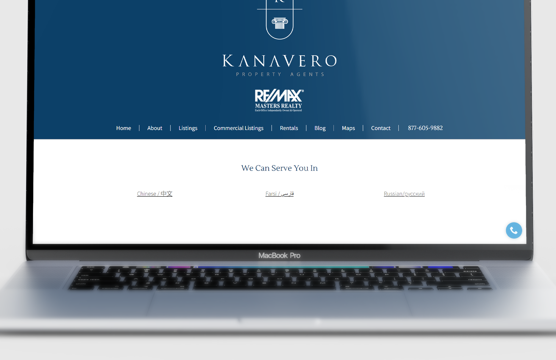
Place prominent headings or highlight blocks showcasing the languages you offer services in. Place this on your header, homepage, go page… wherever it will not be missed on first glance. This clearly conveys multilingual capability without a complex website build.
A Nice-To-Have: Multilingual Listing or Building Descriptions
We can customize certain parts with language tabs to allow switching between up to 3 languages. Human translation works better than machine translation for property marketing copy, where nuance and emotional appeal matter most. You can enter translated listing remarks where it counts.
This is a much less labour-intensive, and more cost-effective way to showcase your multilingual capacities to clients from different backgrounds.
The Bottom Line: Simplicity Rules
As a boutique design agency and SaaS platform hybrid team, our goal has always been delivering meaningful results over flashy features. We don’t aggressively push the bells and whistles that over-promise and under-deliver, nor do we push new technology just for novelty’s sake.
The most effective real estate website features align with fundamental human behavior patterns that remain constant regardless of technological trends. While competitors get distracted by the latest shiny objects, successful agents focus on proven strategies that help real estate professionals connect with quality buyers and sellers.
That requires understanding what real people want: fast access to information, easy comparison tools, and the freedom to browse without pressure. Give them that experience, and they’ll reward you with their business.
Explore Our Real Estate Website Design Packages
Learn more about our boutique website design services and price tiers here (updated September 2025).


